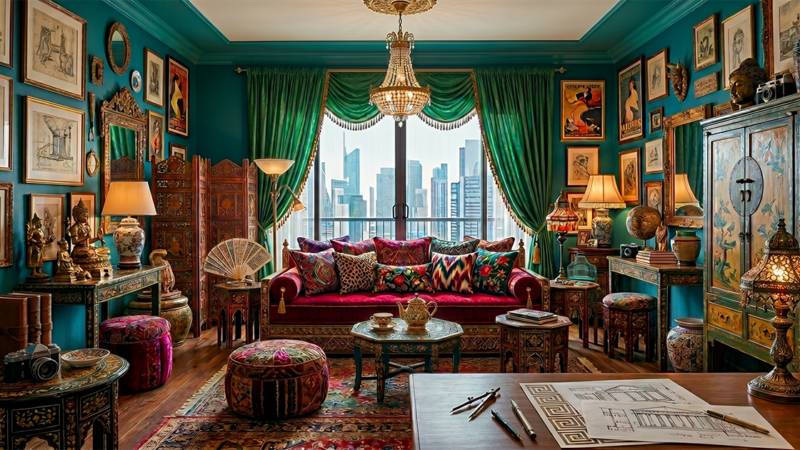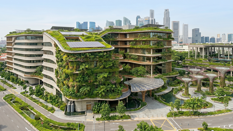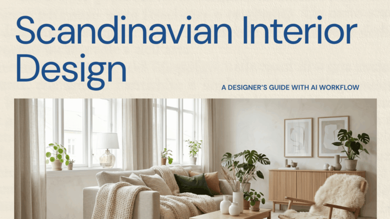

This is the working designer’s guide to specifying mid-century modern interiors well — beyond the Eames lounge and a teak credenza, into the actual material, color, and spatial logic that define authentic MCM. With contemporary references and AI workflow notes for designers running MCM-direction projects in 2026.
What mid-century modern actually means
Mid-century modern emerged from a specific historical moment: post-war American optimism, the GI Bill suburbanization, the influence of European modernist refugees, and the explosion of new materials (molded plywood, fiberglass, plastics) that became available after the war.
The design language that emerged has five durable characteristics:
- Clean, geometric lines. Furniture and architecture both favor straight lines, simple geometric forms, and clarity of structure.
- Organic counterpoint. Geometric lines balanced by organic curves (kidney coffee tables, free-form sofas) and natural materials.
- Integration with landscape. Floor-to-ceiling windows, indoor-outdoor flow, courtyard plans, glass walls.
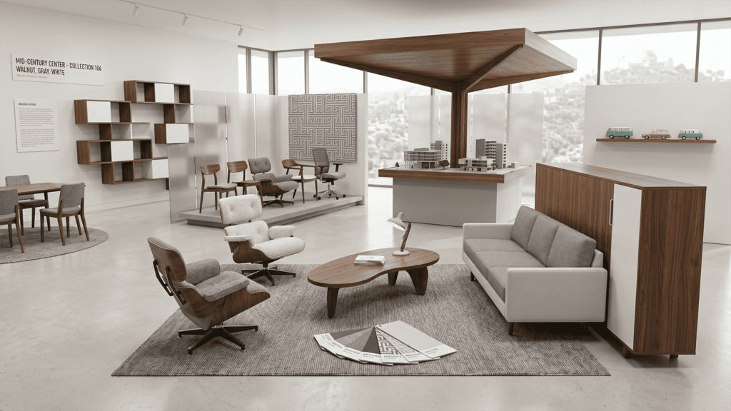
- Walnut and teak. The wood vocabulary is specific — rich, warm, often with visible grain and exposed joinery.
- Democratic intent. Designed for mass production at accessible price points, not bespoke luxury.
The 2026 MCM revival is more historically literate than the 2010s wave — designers now specify by era (early-50s vs. late-60s), by region (California vs. Brazilian vs. Danish), and by influence (Bauhaus vs. Frank Lloyd Wright). Authentic specification has become a competitive differentiator.
The MCM material palette
| Element | Specify | Avoid |
|---|---|---|
| Wood | Walnut, teak, rosewood, oak with visible grain | White-washed pine, painted cabinetry |
| Stone | Travertine, terrazzo, slate | Polished marble (too formal for MCM) |
| Metal | Brushed brass, blackened steel, chrome | Antique iron, hammered copper |
| Textiles | Boucle, tweed, wool, leather, linen | Velvet, silk, ornate jacquards |
| Colors | Mustard, avocado, burnt orange, teal, walnut brown | Cool grays, jewel tones |
| Walls | Wood paneling, plaster, warm paint | Wallpaper (with rare period exceptions) |
| Floors | Walnut, teak, terrazzo, geometric tile | Carpet, gray laminate |

The furniture canon
MCM furniture has a tightly defined canon. Specifying from these designers and lines produces authentic results:
- Charles & Ray Eames — Lounge chair, DCM, DSW, plywood pieces. Herman Miller reissues.
- George Nelson — Marshmallow sofa, coconut chair, ball clock. Herman Miller.
- Eero Saarinen — Tulip table and chairs. Knoll.
- Florence Knoll — Foundational mid-century office and lounge furniture. Knoll.
- Isamu Noguchi — Coffee table, Akari light sculptures.
- Hans Wegner — Crossover with Scandi; CH lounge series.
- Arne Jacobsen — Egg, Swan, Ant chairs. Fritz Hansen.
- Sergio Rodrigues — Brazilian MCM, Mole chair.
- Joaquim Tenreiro — Brazilian MCM, walnut and rosewood furniture.
- Pierre Paulin — French MCM, sculptural upholstered pieces.
Color strategy
MCM color is one of the most identifiable signals of authenticity vs. costume. Real mid-century palettes feature:
- Saturated warm earth tones. Mustard, burnt orange, avocado green, walnut brown.
- Punchy accent colors. Teal, fuchsia, marigold — used architecturally rather than as accessories.
- Wood as a color. Walnut and teak function as warm browns in the palette, not just as material.
- White as a background, not a hero. Walls are often warm white, but the palette overall is colorful.
The 2010s mass-market MCM “white + gray + walnut” palette is not historically accurate. Real mid-century interiors were warm, saturated, and colorful. The 2026 revival has corrected this.
How AI helps MCM project work
MCM projects benefit from AI in three specific ways:
- Period authenticity testing. Generating the same room as early-50s, late-60s, and 70s-revival lets the designer test which era resonates with the client.
- Color study comparisons. MCM lives or dies by color confidence. AI lets the designer test mustard vs. avocado vs. burnt orange as the lead color before committing paint and textile orders.
- Regional variation studies. Brazilian MCM, Californian MCM, and Danish MCM all read differently. AI lets the designer test which regional inflection fits the project before locking specs.
Frequently asked questions
Is mid-century modern still in style in 2026?
Yes — and more legitimately than in the 2010s wave. The 2026 MCM revival is more historically literate, with designers specifying by era and region rather than borrowing surface motifs. MCM has graduated from trend into durable design language.
What’s the difference between mid-century modern and Scandinavian design?
Both share clean lines, craft furniture, and material honesty. MCM tends to be more colorful, more saturated, and more geometric. Scandi is warmer, lighter, and more contemplative. Many of the canonical designers (Wegner, Jacobsen, Aalto) span both labels, making the distinction blurry at the edges.
What colors define mid-century modern?
Saturated warm earth tones — mustard, burnt orange, avocado green, walnut brown — plus punchy accent colors like teal, marigold, and fuchsia. The ‘white + gray + walnut’ palette common in mass-market MCM is not historically accurate.
Can mid-century modern work in a small apartment?
Yes, and arguably better than in large spaces. MCM was designed for post-war suburban houses, but the proportions of the furniture (low, light, leg-revealed) make small rooms feel larger. Specify smaller-scale MCM pieces and prioritize low-profile furniture.
Is mid-century modern furniture worth the investment?
Genuine reissues (Knoll, Herman Miller, Fritz Hansen, Carl Hansen) hold value well and continue to appreciate slowly. Vintage originals appreciate significantly. Cheap MCM-inspired furniture has minimal resale value. For working designers, specifying real reissues remains worth the budget when clients can afford it.
See it in your own projects.
Generate your first AI interior visualization in under 3 minutes. No 3D experience required.