This is the working designer’s guide to producing AI interior renderings that look professional, not amateur. The specific lighting, material, and composition principles that separate publishable AI work from generic AI output — and the prompt patterns that consistently produce premium-quality results.
Why most AI renders look amateur
The same AI tool can produce a render that’s editorial-quality or one that looks like a stock interior image. The difference is rarely the tool — it’s how the operator uses it. Three failure modes account for most amateur-looking AI output:
- Flat or single-source lighting. Real professional photography uses layered lighting — natural light from a window, decorative pendants, table lamps, accent lighting. AI renders that ask for “lighting” without specifying layers get a single flat ceiling-light look.
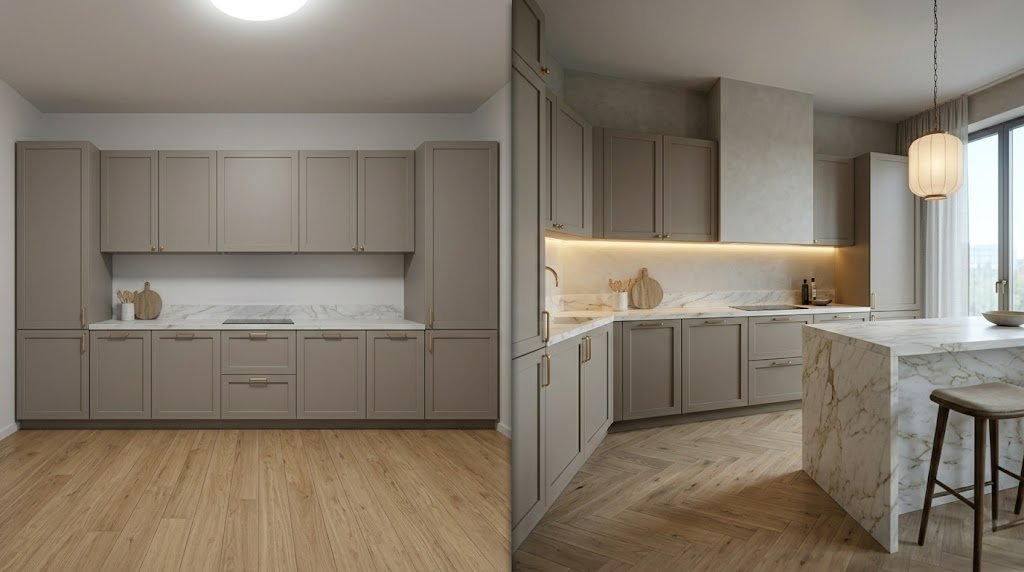
- Generic material specification. Asking for “wood floor” produces a generic wood floor. Asking for “wide-plank white oak floor, oil-finished, with visible grain, in herringbone pattern” produces a specific material. The difference in render quality is dramatic.
- Wrong camera composition. AI renders default to head-on, eye-level, wide-angle shots. Professional designer photography typically uses corner compositions, slightly elevated angles, and 35mm-equivalent focal lengths. Specifying composition produces editorial-quality framing.
Material prompts that look specified, not generic
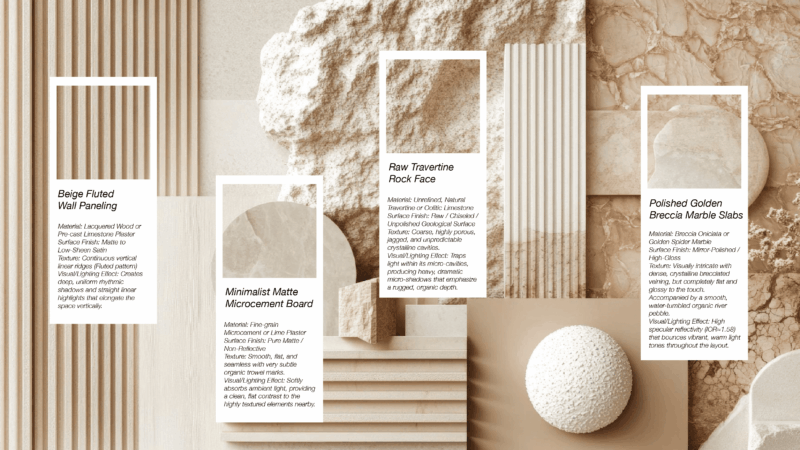
Generic material prompts produce generic materials. Named, specific material prompts produce premium-looking specifications. Examples:
| Amateur | Pro |
|---|---|
| “Wood floor” | “Wide-plank white oak floor, oil-finished, low sheen, with visible grain in herringbone pattern” |
| “Stone counter” | “Honed Calacatta Vagli marble counter with subtle gold veining, mitred edge, 3cm slab” |
| “Wall paint” | “Walls in Farrow & Ball Cornforth White, matte finish, painted continuous through trim” |
| “Sofa fabric” | “Sofa upholstered in heavy boucle, ivory, slight nubby texture, with self-welt cushions” |
| “Metal hardware” | “Cabinet hardware in unlacquered solid brass, satin finish, will develop patina over time” |
| “Wood ceiling” | “Cathedral ceiling clad in 4-inch tongue-and-groove pine, whitewashed, exposed beam structure in dark walnut” |
Composition prompts for editorial framing
Professional interior photography rarely uses centered, head-on, wide-angle shots. The AI render that defaults to those compositions reads as amateur. Specifying composition produces editorial-quality framing:
- Camera position: “shot from the corner of the room”, “from the entry doorway”, “from the seated perspective on the sofa”
- Lens specification: “35mm equivalent focal length” (most editorial), “50mm” (intimate), “24mm” (architectural — use sparingly)
- Composition: “rule of thirds with the [feature] on the right third”, “leading lines from the [feature] toward the [feature]”, “asymmetric balance”
- Camera height: “shot from standing height”, “shot from sitting height for an intimate perspective”, “shot at counter height to emphasize the kitchen island”
- Foreground: “with the coffee table in foreground, partially cropped” creates depth

The ‘editorial’ prompt pattern
A specific prompt structure that consistently produces editorial-quality AI renders. Use as a template:
“[Style descriptor] [room type] in [palette description]. [Material specifications, 3–5 items]. [Lighting layers, 3–5 specifications]. [Hero piece description]. [Camera specifications — position, height, focal length]. [Atmosphere — time of day, mood]. Shot in the style of [reference — Architectural Digest, Elle Decor, Kinfolk, etc.]”
Worked example for a kitchen:
“Quiet luxury kitchen in warm white and natural oak palette. Honed travertine countertops with mitred edges, white oak slab cabinets oil-finished, lime-washed plaster walls with subtle warmth, unlacquered brass hardware, large-format French limestone floor. Natural east morning light through three tall windows, three brass pendants in matte finish 32 inches above the island at 2700K dimmed, ambient sconces on the back wall, no recessed lighting visible. Hero piece is the 12-foot natural oak island with single waterfall edge. Shot from the breakfast nook corner at standing height, 35mm equivalent lens, with the dining chairs in foreground. Soft golden morning atmosphere. Shot in the style of Architectural Digest editorial.”
Post-processing in Photoshop for final quality
- Color correction. Subtle warming of the white point if it reads too cool. Most AI renders default slightly too cool for warm residential.
- Exposure adjustment. Slight lift in shadows and pull-back in highlights for editorial-quality dynamic range.
- Local contrast. Photoshop’s local contrast tool adds subtle dimensionality without making the render look HDR.
- Removing AI artifacts. Generative Fill or Remove tool for any obvious AI mistakes — duplicated objects, distorted hardware, weird hands on furniture.
- Sharpening at output size. Apply sharpening as the last step, scaled to the final output resolution.
- Vignetting. Subtle vignette draws the eye into the composition. Editorial photography always has slight vignetting.
A well-rendered AI interior plus 15 minutes of Photoshop refinement consistently produces publication-quality results in 2026.
Frequently asked questions
How do I make AI interior renders look more realistic?
Focus on three specific dimensions: layered lighting prompts (specify ambient, task, accent, decorative light separately), named material specifications (specific products and finishes instead of generic ‘wood’ or ‘stone’), and editorial composition (corner shots, 35mm equivalent, specific camera heights). The single highest-leverage change is layered lighting prompts.
Why do my AI renders look amateur?
Three common causes: flat single-source lighting from non-specific prompts, generic material descriptions that produce generic textures, and head-on wide-angle compositions that look like stock photos. Fixing these three failure modes typically transforms amateur AI output into publishable quality without changing the AI tool.
What’s the best AI tool for photoreal interior renders in 2026?
Roomwork.ai is purpose-built for interior design with strong fidelity to specified palettes and design languages. Midjourney with detailed prompting produces strong general-purpose results. For specific niche use cases, specialized tools like Stable Diffusion with custom training can outperform general tools. The right choice depends on project type and required specification fidelity.
Should I edit AI renders in Photoshop?
Yes, for final-quality output. AI renders benefit from 10–20 minutes of Photoshop refinement: color correction, exposure adjustment, local contrast, removal of any AI artifacts, sharpening at output size, and subtle vignetting. The combination of AI render plus Photoshop polish consistently produces publication-quality results.
Can AI renders match traditional 3D rendering quality in 2026?
For concept-stage and presentation work, yes. For final-stage publication, editorial, and award submissions, the gap is narrowing but traditional 3D rendering is still preferred at the highest tier. The decisive factor is whether dimensional accuracy is required — AI renders are visually plausible but not measured.
See it in your own projects.
Generate your first AI interior visualization in under 3 minutes. No 3D experience required.